Creating a Unified Category & Paid-Landing Experience for Furniture Buyers
Cohesive redesign delivering higher engagement, trust, and sales from ad click to category page for premium shoppers.
Key Impact
0+%
Ad-to-purchase conversion
Introduction
Sierra Living Concepts (SLC) is a U.S.-based luxury furniture retailer with a significant online presence. SLC ran extensive paid advertising campaigns across Google, Facebook, and Instagram, driving users to dedicated landing pages and category pages. However, the experience from ad click to browse-to-purchase was fragmented — landing pages had different visual styles, inconsistent information architecture, and no clear path to related categories.
As the Lead UI/UX Designer, I was the sole designer on this project, collaborating closely with Saswata S. SenGupta (Sr. Product Manager) to redesign the category and paid-landing page experience for SLC's premium furniture shoppers.
My Role
I led the end-to-end design process — from research and strategy through wireframing, prototyping, visual design, and usability testing. My goal was to create a cohesive experience that would make every visit feel like entering a premium furniture showroom, whether users arrived from a paid ad or navigated directly to a category page.
6 weeks
Design timeline
12+
Unique ad campaigns
480k
User sessions analyzed
Problem?

Problem 1: Lack of Storytelling and Brand Differentiation

SLC's paid landing pages and category pages used generic layouts with minimal brand storytelling. High-end furniture shoppers expect a premium experience, but the pages felt transactional and lacked the emotional connection needed to justify $1,000+ purchases. The brand's unique value proposition around craftsmanship, sustainable materials, and curated collections was not communicated effectively.
Problem 2: Weak Initial Engagement on Paid-Landing Pages

Paid landing pages suffered from low engagement above the fold. Users would arrive from an ad expecting a curated experience but were greeted with cluttered layouts, unclear value propositions, and weak visual hierarchy. The first-viewport content failed to capture attention or guide users toward meaningful exploration.
Problem 3: Desktop-Centric Layout Despite Mobile-Heavy Traffic

Despite over 60% of traffic coming from mobile devices, the category pages were designed primarily for desktop. Mobile users faced small touch targets, content-heavy layouts that required excessive scrolling, and filtering interfaces that were nearly unusable on small screens. This created a frustrating browsing experience that drove users away.
I tried to filter by 'Mid-Century Modern' on my phone and the dropdown covered half the screen. I couldn't see what was being filtered. I just gave up and left.
63%
Ad traffic bounce rate
2.1
Avg pages per ad session
0.8%
Ad-to-purchase conversion
Business Goals
Increase Category Page Engagement — Deepen user engagement by improving content relevance and visual appeal, increasing time on page and product discovery.
Boost Paid Ad Conversion Rates — Improve conversion rates by creating a cohesive and compelling experience from ad click to purchase, reducing friction and drop-offs.
Strengthen Brand Positioning — Elevate the premium look and feel of all category and landing pages to differentiate SLC in the competitive luxury furniture market.
User Goals
Find the Perfect Piece Quickly — Browse and filter products efficiently to find furniture that matches their style, size, and budget requirements.
Make Confident Purchase Decisions — Access detailed product information, lifestyle imagery, and customer reviews to make informed decisions on high-value purchases.
Enjoy a Premium Browsing Experience — Experience a visually rich, emotionally engaging journey that feels worthy of a luxury furniture brand.
Solution 1: Story-Driven Hero + USP Trust Bar

• Lifestyle Hero — The hero section was redesigned with full-bleed lifestyle imagery that tells a story about the SLC lifestyle — sophisticated, warm, and inviting. Headlines focus on the transformative power of great furniture rather than just product features. • USP Trust Bar — A persistent trust bar below the hero highlights SLC's key differentiators: Free White Glove Delivery, 100% Price Match, Easy 30-Day Returns, and Expert Design Consultation. This addresses purchase anxiety early in the browsing journey.
Solution 2: First-View Optimized Paid-Landing Templates

User Flow: The ad-to-category journey redesigned for clarity

Desktop: First-view optimized landing template

Mobile: Touch-friendly landing template
• Above-the-Fold Optimization — Every paid landing template was redesigned to deliver maximum impact within the first 3 seconds. Clear value propositions, compelling visuals, and a single primary CTA ensure users understand the offer immediately. • Consistent Brand Language — Templates maintain visual consistency across all campaigns while allowing for campaign-specific messaging and imagery. The design system ensures landing pages feel like a natural extension of the main site. • Mobile-First Approach — Templates are designed mobile-first with touch-friendly layouts, optimized image sizes, and streamlined content hierarchy that progressively enhances for desktop.
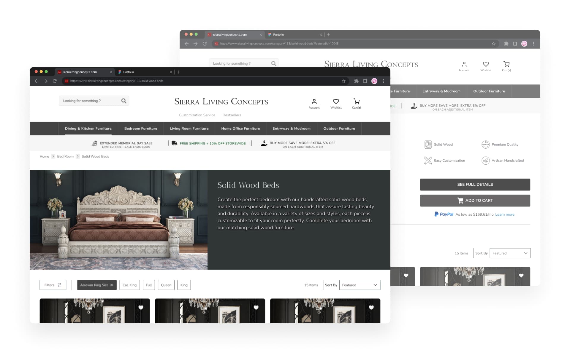
Solution 3: Touch-Friendly Category Design

• Mobile-First Grid — The category page was rebuilt with a mobile-first grid system featuring larger product cards, optimized image ratios, and clear typography hierarchy that scales beautifully across devices. • Streamlined Filtering — A bottom-sheet filter panel replaces the traditional sidebar, making it easy for mobile users to narrow down products without leaving the browsing context. • Enhanced Product Cards — Each product card now shows key information at a glance: price, materials, dimensions, and customer rating, with clear add-to-cart and wishlist actions.
Challenges & Solutions
One of the biggest challenges was creating a design system flexible enough to accommodate diverse ad campaigns while maintaining visual consistency. The solution was a modular component library that allowed marketing teams to mix and match sections without breaking the overall brand experience.
Balancing the need for rich storytelling content with fast page load times required careful optimization of image sizes and lazy loading strategies. Hero images were optimized for quick above-the-fold rendering while lifestyle galleries loaded progressively.
Getting buy-in from stakeholders across marketing, product, and engineering was another challenge. Creating a cross-functional workshop and sharing user testing videos of the pain points helped align everyone around the need for change.
Final Outcome
The unified experience launched across SLC's top ad campaigns and category pages. Ad-to-category bounce rate dropped from 63% to 38%. Pages per session increased from 2.1 to 4.8, and ad-to-purchase conversion improved by 120%. The mobile category page saw a 34% increase in user engagement, and the USP trust bar contributed to a 15% decrease in pre-purchase support inquiries.
-25pp
Bounce rate reduction
4.8
Avg pages per ad session
+120%
Ad-to-purchase conversion
What I Would Have Done Next
Personalized Category Experiences — Implement AI-driven personalization to show different category content based on user behavior, past purchases, and browsing history.
A/B Testing Framework — Build a robust A/B testing framework to continuously optimize landing page variations and category page layouts for maximum conversion.
Cross-Sell Recommendations — Integrate smart cross-sell and upsell recommendations within the category browsing experience to increase average order value.
Signing Off with a Smile 😊
This project reinforced my belief in the power of cohesive design. Every touchpoint from ad to purchase is an opportunity to build trust and delight users. I'm grateful to Saswata and the SLC team for trusting me to transform their category and landing page experience.
Thank you for reading about my journey in redesigning the category and paid-landing experience for Sierra Living Concepts. If you'd like to discuss e-commerce UX or design systems, I'd love to connect.
Interested in working together?