Redesigning Cart & Checkout, Reducing Abandonment by 26% Across 480k User Sessions
Focused on optimizing checkout flows to boost conversions and decrease abandonment for Sierra Living Concepts, a brand of luxury furniture shoppers in U.S.
Key Impact
0%
Cart abandonment reduction
Introduction
Sierra Living Concepts (SLC) is a U.S.-based luxury furniture retailer with a significant online presence. SLC had a requirement to increase online sales and meet customer expectations through a seamless checkout experience.
As the Lead UI/UX Designer, I was the sole designer on the project, collaborating closely with Saswata S. SenGupta (Sr. Product Manager) to tackle conversion challenges on the cart and checkout pages.
Problem Statement

Problems & Insights
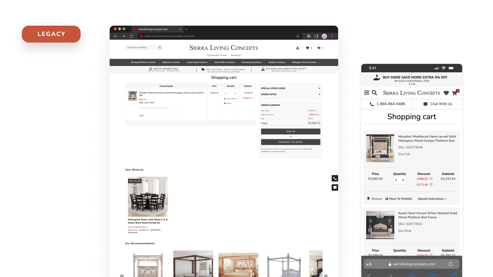
Problem 1: Distractions and Overload on Cart Page — SLC's Cart Page suffered from its own success. It was so feature-rich that it overwhelmed shoppers. With too many distractions like excessive product recommendations and prominent marketing banners, customers frequently lost focus and abandoned their carts.
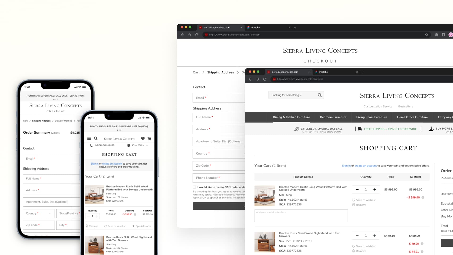
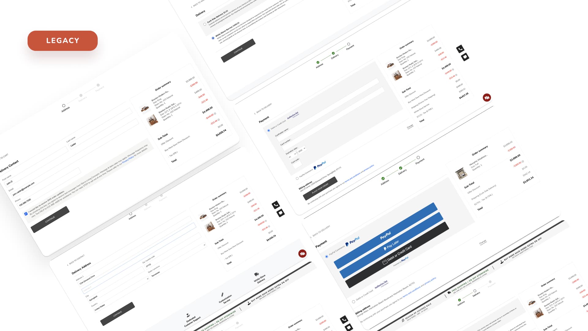
Problem 2: High Checkout Abandonment Rate — The checkout process was a 5-step linear flow with no progress indicator. Users had to create an account before completing a purchase, creating an unnecessary barrier. Form fields were dense, error messages were generic, and the mobile checkout was nearly unusable with tiny tap targets and horizontal scrolling tables.

Problem 3: Navigation and Form Field Issues — The checkout flow suffered from inconsistent navigation across mobile and desktop. On mobile, the 'Continue' button was hidden below the fold, causing users to think the page wasn't loading. On desktop, the multi-column layout created confusion about the natural reading order.
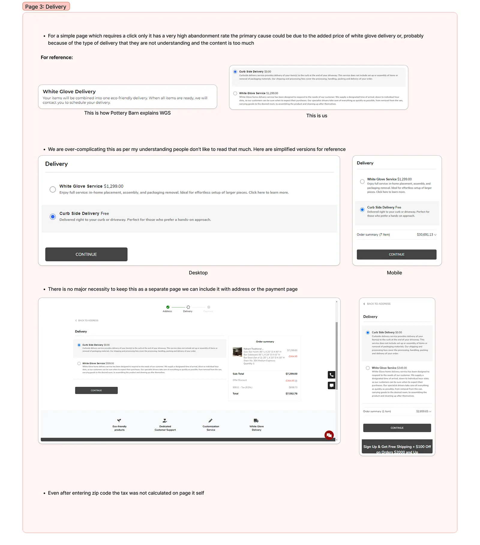
Problem 4: Complex Delivery Options and Confusion — Delivery options were complex and unclear. Users couldn't see estimated delivery dates before checkout and were frustrated by unexpected shipping costs appearing late in the flow.
I was ready to buy a sofa for $2,000, but the checkout asked me to create an account first. I didn't want another account and a password to remember, so I just left.
71%
Cart abandonment rate
5
Checkout steps
480k
User sessions analyzed
Shopping Journey Of A User

Business Goals
Increase Conversion Rates — Streamline the checkout flow to reduce friction and drop-offs, converting more visitors into customers.
Decrease Cart Abandonment — Identify and eliminate pain points in the cart and checkout experience that cause users to leave before completing a purchase.
Boost Customer Confidence — Build trust and reassurance throughout the checkout process with clear communication about shipping, returns, and payment security.
User Goals
Quick & Easy Checkout — Users want to complete their purchase in as few steps as possible, without unnecessary obstacles or information requests.
Clear Pricing & Delivery Info — Users need transparency about total costs, taxes, shipping fees, and delivery timelines before committing to purchase.
Flexible Shopping Experience — Users want the ability to review, modify, and confirm their cart contents easily without losing progress.
New Cart Checkout User Flow

Solution 1: Distraction-Free Cart Page
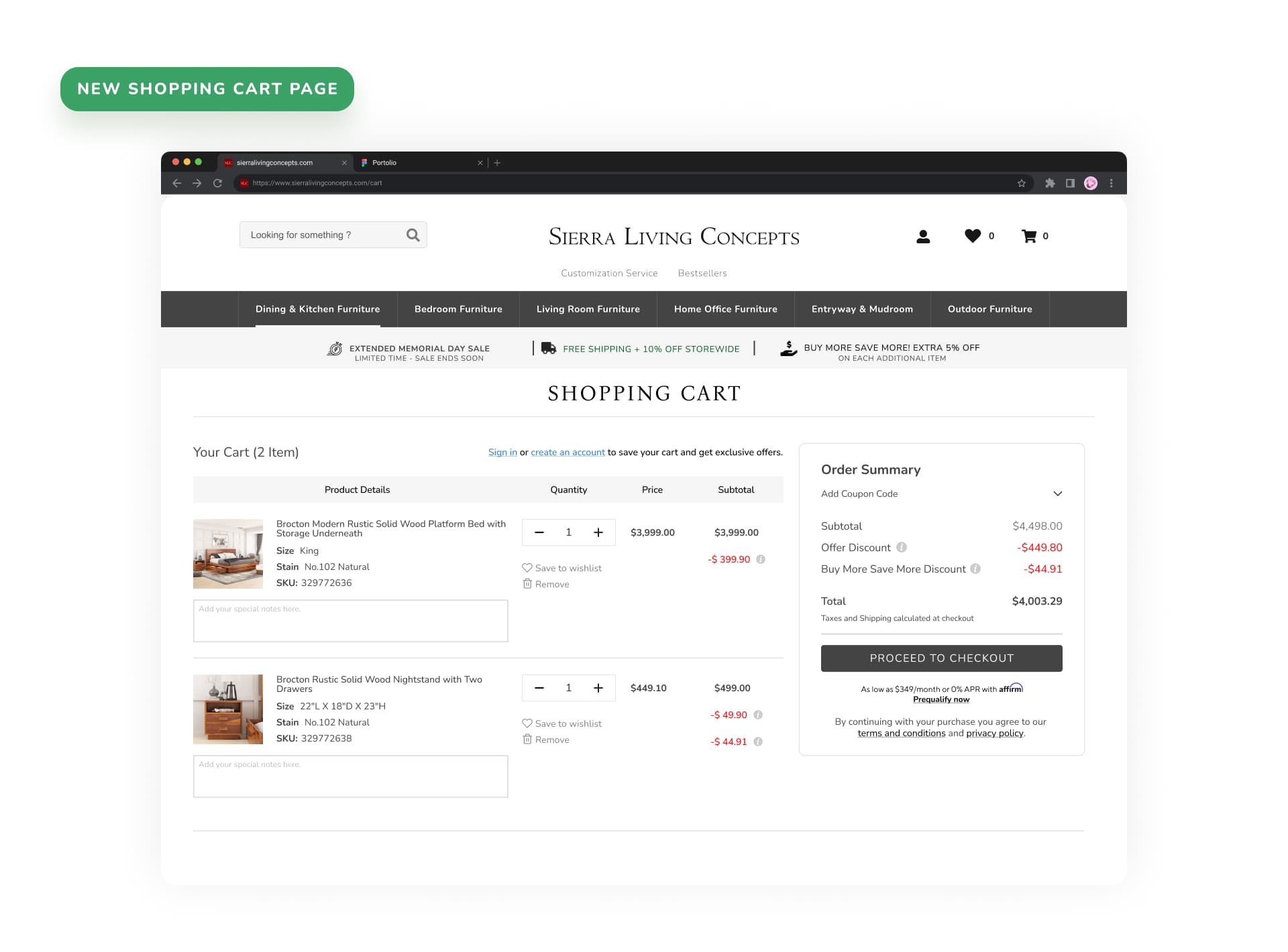
• Inline Cart Editing — Users can update quantities, remove items, or save for later directly in the cart without navigating away. • Persistent Order Summary — A sticky sidebar that shows real-time totals, estimated shipping, and tax calculations as users make changes. • Trust Signals — Security badges, return policy highlights, and customer service access placed at strategic decision points. • Clear CTA Hierarchy — Primary 'Proceed to Checkout' button is visually dominant, with secondary actions like 'Continue Shopping' clearly de-emphasized.
Solution 2: Streamlined Address Entry & Inline Validation
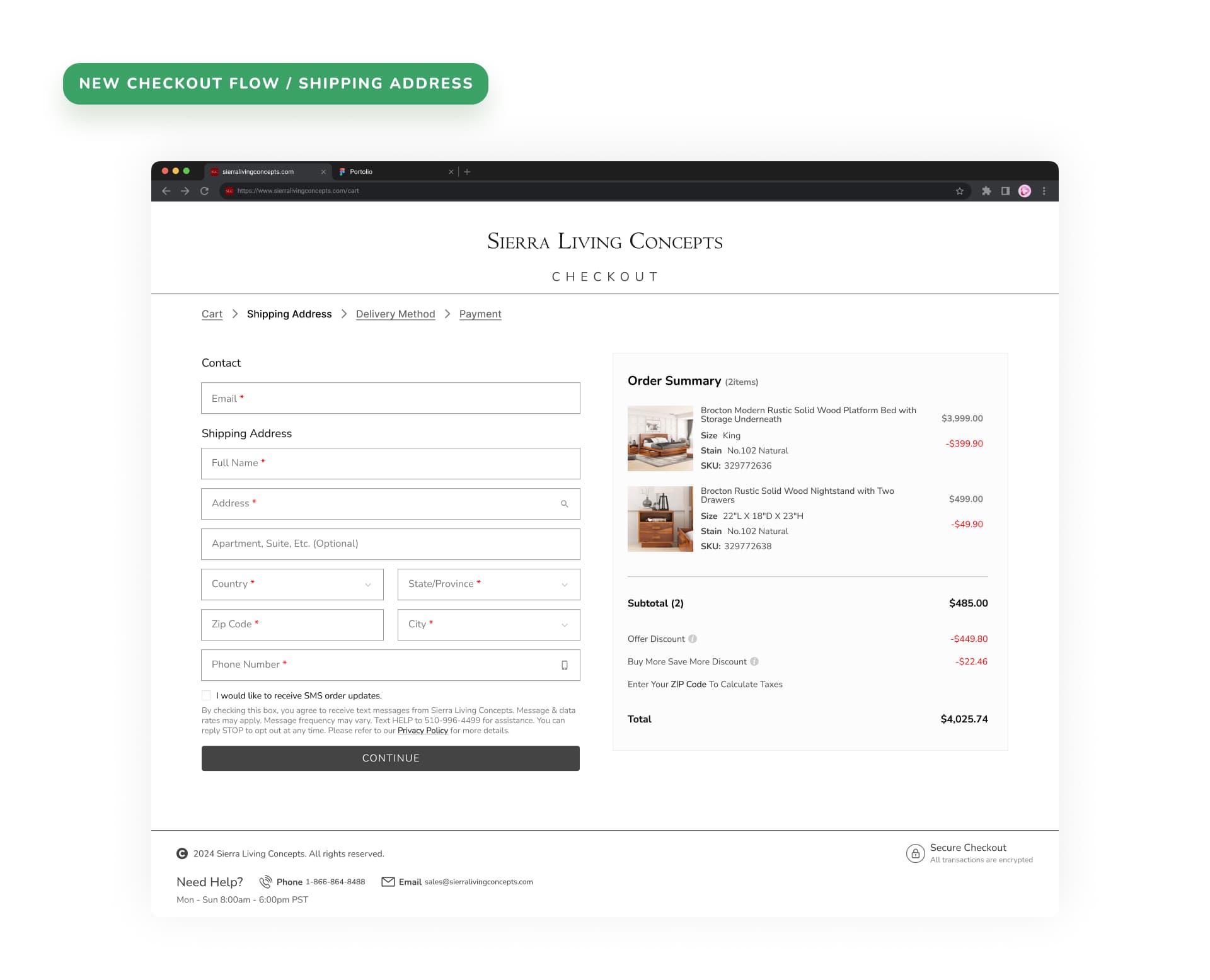
• Progressive Disclosure — Information is requested in logical stages, reducing cognitive load and making the form feel less intimidating. • Guest Checkout Default — No account required to purchase. Account creation is offered as an optional post-purchase step. • Smart Defaults — Saved addresses for returning users, automatic tax calculation display, and estimated delivery dates shown before checkout. • Inline Validation — Real-time field validation with clear error messages that tell users exactly how to fix the issue.
Solution 3: Simplified Delivery Method Selector
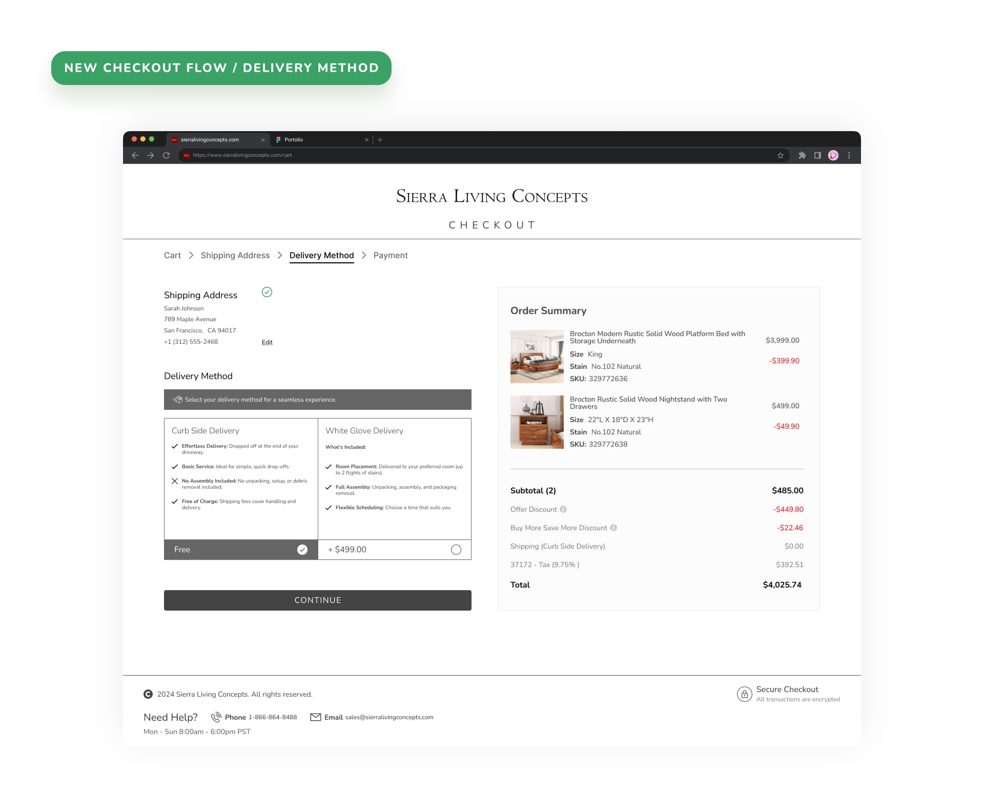
• Simplified Selector — Delivery options are presented in a clear, visual card layout showing price, speed, and estimated delivery date at a glance. • Estimated Delivery Dates — Real-time delivery date calculations based on ZIP code and product availability, shown before the user commits to purchase. • Cost Transparency — Shipping costs, taxes, and total are displayed upfront with no surprise fees at the final step.
Challenges & Solutions
Handling the complexity of multi-page checkout flow while maintaining a seamless experience across devices was one of the biggest challenges. The solution required careful information architecture decisions — what information to show on each page, how to handle form state across pages, and how to provide clear feedback without overwhelming the user.
Balancing business requirements (account creation for marketing) with user needs (guest checkout) led to a compromise: guest checkout with optional post-purchase account creation. This single change removed the biggest barrier to purchase while still allowing SLC to capture user data after the transaction.
Ensuring responsive design consistency across devices meant designing mobile-first and progressively enhancing for desktop. Every component was tested at multiple breakpoints to guarantee a consistent experience.
What I Would Have Done Next
Saved Payment Methods — Implement stored payment methods for returning customers, reducing checkout friction even further with one-tap purchases.
One-Click Checkout — Integrate digital wallet options like Apple Pay, Google Pay, and Shop Pay to enable express checkout for returning and new users alike.
Abandonment Recovery — Introduce cart abandonment email sequences with saved carts, limited-time offers, and direct links to resume checkout where they left off.
Results
The redesigned checkout launched with a phased A/B test. Cart abandonment dropped from 71% to 45%, a 26 percentage point reduction. Guest checkout was used by 68% of first-time purchasers. Mobile conversion rate increased by 34%.
-26pp
Cart abandonment reduction
68%
Guest checkout adoption
+34%
Mobile conversion increase
Signing Off
This project taught me the power of removing friction. Every field removed, every step collapsed, every error message rewritten — each small change compounded into a dramatically better experience. I'm grateful to Saswata and the SLC team for trusting me to redesign such a critical part of their business.
Thank you for reading about my journey in redesigning the cart and checkout experience for Sierra Living Concepts. If you'd like to discuss e-commerce UX or checkout optimization, I'd love to connect.
Interested in working together?